This printscreen is showing whether or not people find the name of my magazine appealing after looking at it. It shows that almost everyone found it appealing.
This printscreen is showing what people think my magazine genre is. People were allowed to choos more than one answer if they wanted to. As you can see the majority thought it was Hip Hop and R&B which shows that my magazine had met the target of looking like a Hip Hop / R&B magazine. This printscreen also shows that only 3 people thought it was rock, the reason for this is that because of the bold colours used such as red and black and Nino was also wearing black.
This printscreen is showing who people thought my target audience were for my magazine. They had to choose the type of gender or genders that my magazine was targeting as well as the type of people that listen to a particluar genre of music. The reseults show that Hip Hop and R&B fans were targeted to both males and females which is exactly what my magazine was aiming for despite the front cover of my magazine looked a bit masculine which is probably why one of the popular results was that the target gender was males.
This printscreen is showing a poll of the how high or low people rated my front cover. As you can see 7 and 9 were the joint higher common ratings and suggests that my magazine is quite successful in appearance and that the audience were able to recognise the genre and target audience of my magazine.
This printscreen is showing a poll of the how high or low people rated my contents page . As you can see 7 was the most common high following by the second common high score of 10. One person left a comment that 'really clear and to the point pictures help' which suggests to me my target audience readers prefer images that don't leave the audience guessing to much.
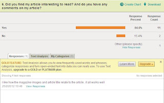
This printscreen is showing whether people enjoyed reading my magazine article or not. It has proved success as only two people out of everyone who read the article didn't enjoy reading the article. But a comment was left saying how the images and article title show relations which does foreshadow the topic of the actual article.
This printscreen is showing how much people rated the images used in my magazine as their overall judgement. 8 was the highest common score following 9 and 10 joint second most common. This suggests that the images are really effective in terms of production and angles.
This printscreen is showing whether people found the price of my magazine reasonable and the majority said yes. One person commented that they would 'reduce it by a pound', but my magazine will be released monthly and this price was a comprimise between considering how costs would be covered up for producing the magazine and also ensuring that it's not to pricey for my target audience for when they purchase it.
This printscreen is showing the relation to the reasonability of my magazine price and to whether they would actually buy it. It's showing that the same number of people who thought that the price was reasonable, that they would consider buying it as well.


No comments:
Post a Comment